#TAGETHER
PROJECT OVERVIEW
- Timeframe: 4 months
- Team size: 4
- Role: UX Researcher, UX Designer
- Target user: Social media users, event planners
- Platform: Mobile
- Tools used: Contextual Inquiry, Surveys, UX Testing (in person and remote), Sketch, InVision
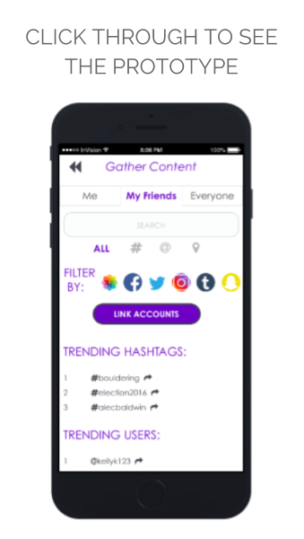
This group project was completed for Professor Fleming Seay's Interaction Design class at the iSchool during Fall 2016, with Katie Hicks, Caroline O'Meara, and Austin Reilly. #Tagether is a tool that aggregates content from across social media to enable users to create their own videos.
Our final prototype—after 4 rounds of testing, 26 users tested, and 5 iterations—can be seen in this video:
We chose to present our 5th iteration in a video in order to show the interactions we envisioned that we were not able to create using InVision.
We set out to create a product that would afford users a quick and easy way to gather content from social media to create videos. There are two facets that allow users to engage with our platform: search and ‘tagging’. By sourcing content using not only locations and user names, we open up avenues to users by allowing them to filter by hashtag. Once their content is compiled, users can personalize their videos using captions, music, and themes. #Tagether is not a social media platform but allows users to save videos to their own device and post to social media. #Tagether enhances users’ experiences of social sharing by enabling seamless video creation from source material collected across multiple platforms.
Contextual inquiry was used to create a user scenario: this app would serve those who either attend or coordinate events. The individuals I sought out and interviewed met certain criteria: had recently planned events using social media and actively used 3 forms of social media platforms (either Facebook, Twitter, Instagram, or Snapchat). These interviews utilized a variety of questions but allowed individuals the comfort and freedom of expressing themselves through conversation.
Competitive analysis was performed in order to evaluate the competitive landscape, paying close attention to features currently available and user's reviews of apps on the market. The team created an affinity diagram to parse out themes, this allowed us to posit potential requirements, functionality, and features to meet our users needs. We then conducted an online survey using Qualtrics to determine market demand for a video creation application and to further understand how individuals may use it. The survey allowed us to understand the features most important to our market. This allowed us as a team to further develop the concept of our product. Initially we prioritized social media over video creation, however this shifted as we learned more about the ways guests interact with events, particularly through hashtags.
Our first round iteration used sketches that each group member created. As a group we decided how we would organize our vision and I mocked up the design in Sketch. In order to test the basic concepts and functionality of our application, we chose to use a grayscale paper prototype so that we could garner unfiltered feedback from users. This also allowed us to evaluate if users would follow the funnel we imagined. This version was tested with 6 participants.
We utilized an iterative design process for the remainder of the project, utilizing usability research in each round. The design lifecycle began at a low-fidelity paper based prototype and evolved into a high-fidelity prototype.
Iteration 2
For our second round, medium-fidelity design we used InVision. This allowed us to test how users respond to interactions as well as how they handle navigating through the application. 5 participants were tested in person using the InVision mobile app.
Iteration 3
For our third and fourth rounds of user testing we made use of UserTesting.com. For these rounds of testing we had users test #Tagether using InVision’s website in order to be able to see where participants were attempting to click.
Iteration 4
Testing of our 3rd iteration uncovered additional changes we wanted to make before deploying our final 12 tests. Most of the tweaks were in the design screens, where the user can add a caption, theme, and soundtrack. We made the cover image for the video smaller so that features “below the fold” would not be missed.


